Four navigation types shape a clear ecommerce journey: global navigation connects shoppers to the store’s main areas, local navigation organizes a section, contextual navigation links related pages or products, and utility navigation supports tasks such as accessing an account or reviewing the cart. That structure matters, but a menu packed with links isn’t automatically intuitive. Shoppers need clear labels, useful category paths, and easy ways to find products on mobile and desktop. To improve ecommerce navigation, reduce decision friction rather than add complexity.
You’ll learn what navigation optimization involves and how menus, search, breadcrumbs, and mobile-friendly controls help shoppers move from browsing to relevant products, how to organize categories into understandable paths, and how analytics can reveal where visitors hesitate, which routes they take, and where changes can make shopping clearer.
Key Takeaways
- Build connected paths from main menus to categories, subcategories, and product pages so shoppers and search engines can discover your catalog.
- Pair on-site search with useful autosuggestions and filters to help shoppers narrow choices without adding extra navigation layers.
- Give priority categories and products clear visibility, using labels and groupings that make the next step easy to recognize.
- Use analytics to identify where shoppers stall or leave, then evaluate navigation changes against real user behavior.
1. What is navigation optimization?
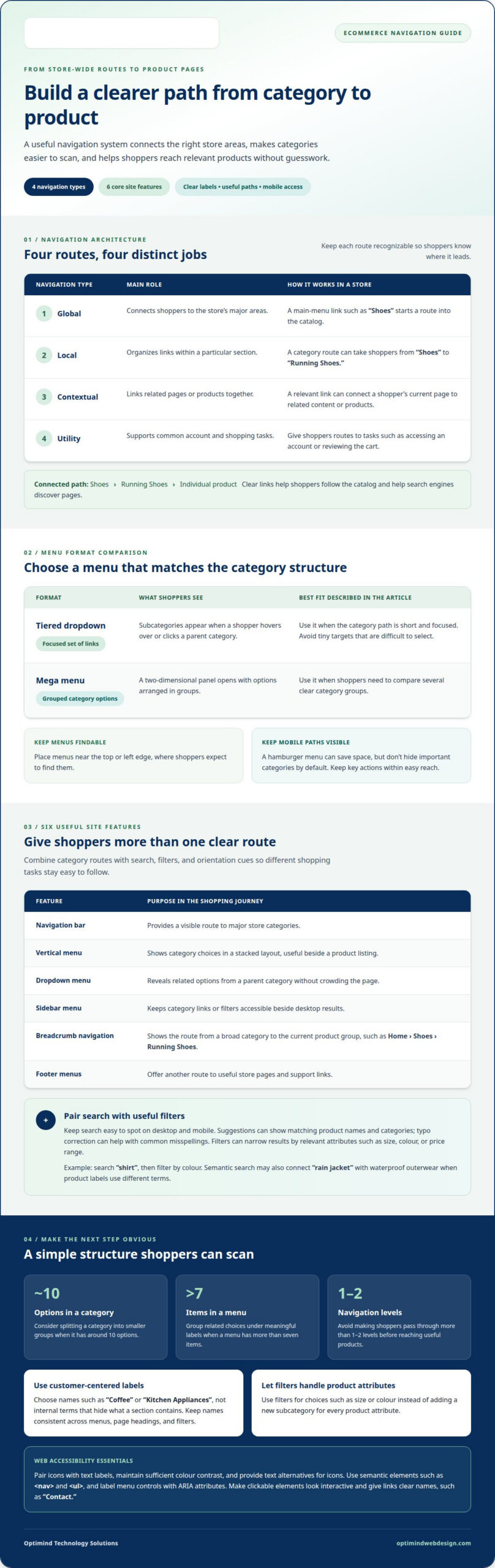
Navigation optimization organizes links so shoppers can move from the main menu to categories, subcategories, and product pages. It also clarifies four navigation types: global navigation connects major store areas, local navigation organizes a section, contextual navigation links related content, and utility navigation supports tasks such as accessing an account. For example, a global “Shoes” link can lead to “Running Shoes,” then to individual products. These connected paths help shoppers understand the catalog and help Google discover pages through links.
Menu design determines how quickly shoppers can see those paths. A tiered dropdown reveals subcategories when a shopper hovers over or clicks a parent category. A mega menu opens a two-dimensional panel with grouped options. Use a mega menu when shoppers need to compare several clear category groups; choose a smaller dropdown for a short, focused set of links. Keep menus near the top or left edge, where shoppers expect to find them, and avoid tiny dropdown targets that are difficult to select.
On mobile, a hamburger menu can save screen space, but don’t hide important categories by default. Tabs can switch between related views, while vertical navigation can show a category hierarchy beside page content. Make each control visibly clickable and give links clear labels, such as “Contact,” rather than an ambiguous icon. If a mobile menu includes a phone number, make it tappable so shoppers can call directly from the screen.
For accessible navigation, pair icons with text labels, maintain sufficient color contrast, and provide text alternatives for icons. Use semantic HTML elements such as <nav> and <ul>, and label menu controls with ARIA attributes. These are practical web accessibility practices, not a claim about a specific Philippines legal requirement.
Menus establish the route into the catalog; breadcrumbs show shoppers where they are within it. A trail such as “Home > Shoes > Running Shoes” helps shoppers stay oriented and return directly to broader categories. Together, clear menus and breadcrumbs reduce guesswork and make product paths easier to follow, an approach often emphasized by retail specialists like NB eCommerce & Design when designing unified commerce catalog structures.
2. What top 6 features are a must for any ecommerce site?
Good ecommerce navigation pairs clear menus with a search path for shoppers who already know what they want. Keep the search bar easy to spot on desktop and mobile, show useful suggestions as shoppers type, and correct common typos. Autosuggest can display matching product names and categories, helping shoppers choose a result without entering a full query.
Filters help shoppers narrow broad results by relevant product attributes, such as size, colour, or price range. Search and filters should work together: someone looking for a black shirt can search “shirt,” then filter by colour. Semantic search can also interpret related wording, so “rain jacket” may surface waterproof outerwear even when product labels use different terms.
- Navigation bar: Gives shoppers a visible route to major store categories.
- Vertical menu: Displays category choices in a stacked layout, useful beside a product listing.
- Dropdown menu: Reveals related options from a parent category without crowding the page.
- Sidebar menu: Keeps category links or filters accessible beside desktop results.
- Breadcrumb navigation: Shows the route from a broad category to the current product group.
- Footer menus: Provide another route to useful store pages and support links.
For Filipino shoppers, useful patterns across phone and desktop include familiar category names, visible search, and filters that match the products sold. A mobile layout should keep key actions within easy reach, rather than forcing shoppers to open several layers just to see categories.
Follow these practices: use specific labels, make clickable elements look interactive, and keep search results relevant to the query. Avoid vague menu names, tiny tap targets, hidden category paths, and filters that act like separate categories. If shoppers can’t find the search bar or tell which controls work, simplify the screen and clarify each action.
3. What is intuitive navigation?
Intuitive navigation makes the next step clear before shoppers have to guess. Use customer-centered labels such as “Coffee” or “Kitchen Appliances,” not internal terms such as “Collections” that hide what a section contains. Clear labels help shoppers find relevant products, compare options, and continue toward purchase. Keep category names consistent across the main menu, page headings, and filters.
Structure the catalog broadly and keep its depth shallow. When a category has around 10 options, consider splitting it into smaller groups. Avoid pushing shoppers through more than 1-2 navigation levels before they reach useful products. If a menu has more than seven items, group related choices under meaningful labels. For example, place “Espresso Machines” and “Coffee Grinders” beneath “Coffee Equipment,” rather than presenting one long list.
Chunking makes each section easier to scan, especially on a phone. Group subcategories by shopper intent, product type, or a defining feature, then use short labels to distinguish each group. Avoid creating a new subcategory whenever a product attribute changes. Shoppers looking for a particular size or colour are usually better served by filters, which narrow a product list without expanding the menu.
Promote important categories and products where their relevance is clear. A seasonal “Rainwear” category or a featured product linked from a related category gives shoppers a direct path without replacing the main catalog. Make sales and deals easy to find through a clearly named “Sale” section or a price filter; don’t create overlapping categories for every promotion. For example, someone browsing “Backpacks” can use a sale filter to find discounted items while staying in that product section.
Use usability testing to prioritize labels and groupings. Give shoppers representative tasks, such as finding a specific product or locating a sale item, then observe where they hesitate or choose the wrong section. This evidence helps teams refine the structure around real shopping decisions rather than internal assumptions.
4. Analytics-based navigation optimization
Analytics show how shoppers move through your store, not just which pages are popular. Map journeys from homepage to category, product, and checkout, then look for exits, repeated searches, and paths that rarely lead to relevant products. For example, frequent searches for an item that’s absent from the main menu may point to a visibility problem.
Compare navigation behavior across devices and traffic sources. If mobile visitors open a menu but rarely select its categories, inspect the tap targets, menu depth, and label clarity. Searches that return no useful results can reveal missing synonyms, unclear product names, or catalog gaps. Treat each signal as a specific hypothesis, not a reason to redesign the entire store.
Prioritize changes by their likely effect on the shopping journey. You might move a frequently visited category into a more direct menu path, rename an unclear label, or make a high-demand product easier to reach. When feasible, A/B testing compares the current version with a targeted alternative. Track category visits, product views, add-to-cart actions, and completed purchases.
To improve ecommerce navigation, remove friction between shopper intent and the next useful page. Clearer labels, relevant category links, and a shorter route from a homepage promotion to its products can encourage visitors to continue. These changes may support conversion and reduce bounce rate, but results depend on the store and its audience. Assess performance against defined metrics rather than assumptions.
A disciplined approach to improving ecommerce navigation reviews each test by device, entry page, and shopper path. If a new menu increases category visits but not product engagement, the category page may need attention next. This cycle of measurement and refinement keeps decisions grounded in observed user experience and gives each change a clear purpose.
Optimind Technology Solutions
Optimind Technology Solutions helps turn navigation findings into a clearer shopping experience. Its UX Design and E-Commerce Development work can align category structures, search, product pages, and mobile journeys with how shoppers browse and buy.
Turn to the team when shoppers struggle to find products, navigation no longer fits your catalog, or analytics point to friction along the purchase path. Web Design and Development can address the wider store experience, while Custom Web Application Development can support specialized shopping workflows.
With the right structure in place, shoppers can navigate your store with less guesswork and clearer next steps. Contact Optimind Technology Solutions to discuss your ecommerce navigation needs.
Set a Clear Direction for Your Store
Navigation should grow with your catalog, customer needs, and business priorities. Treat each change as part of a planned improvement cycle: identify the shopping problem, define the intended experience, and assess how the updated path supports your business goals. A focused approach to improving ecommerce navigation helps your team make purposeful decisions instead of adding features without a clear reason.
When your store needs a larger redesign or more tailored shopping flows, Optimind Technology Solutions can bring together UX Design, Web Design and Development, and Custom Web Application Development. The team’s experience designing and building digital experiences can help connect shoppers’ browsing needs with your site’s structure and business requirements.
Take the next step with a clear view of the changes your store needs. Discuss your ecommerce project with Optimind Technology Solutions, and move forward with a more deliberate plan for your online store.
Frequently Asked Questions
What are the 4 types of navigation?
The four types are global, local, contextual, and utility navigation. Global navigation can take shoppers from the homepage to departments; local links organize options within one department; contextual links connect related products or guidance; utility links support tasks such as accessing an account and reviewing the cart. A product page might use contextual links to suggest matching accessories, while utility navigation keeps order history accessible.
What is intuitive navigation?
Intuitive navigation lets shoppers understand a store’s layout without learning its internal terminology. For example, a new visitor looking for a gift should be able to distinguish gift cards from gift-ready products. Clear page titles, consistent link placement, and an easy route back from product details help prevent dead ends and make the next choice easier to identify.
What is navigation design?
Navigation design is the planning of how links, menus, labels, and page relationships guide people through a site. It goes beyond the header: a designer considers how category pages, product pages, and account areas connect. For a store selling both appliances and replacement parts, navigation design can link parts to compatible product information.
What is navigation optimization?
Navigation optimization refines those paths so shoppers can reach useful information with less confusion. A team might review a store’s product structure, identify overlapping sections, and adjust labels or link placement to make choices clearer. The goal is a more effective journey, not simply a shorter menu or more links.
What top 6 features are a must for any ecommerce site?
Six useful features are a navigation bar, vertical menu, dropdown menu, sidebar menus, breadcrumb navigation, and footer menus. Their value depends on the page: a sidebar can support browsing in a large catalog, while breadcrumbs help shoppers return to a broader department. Choose features that serve distinct tasks instead of placing every menu style on every page.
Why is user-friendly ecommerce navigation important?
User-friendly navigation helps shoppers find relevant products, understand their options, and continue toward checkout with fewer interruptions. It also gives your business a clearer way to direct attention to useful categories, product details, and support information. When visitors can’t tell where to go next, they may leave before comparing products or completing a purchase.